
Sensible Defaults do not exist, and neither do Best Practices: Tool UI should be easily customizable
You can watch the video below, but if you prefer reading then the entire text of the video is available below.
This is Unity
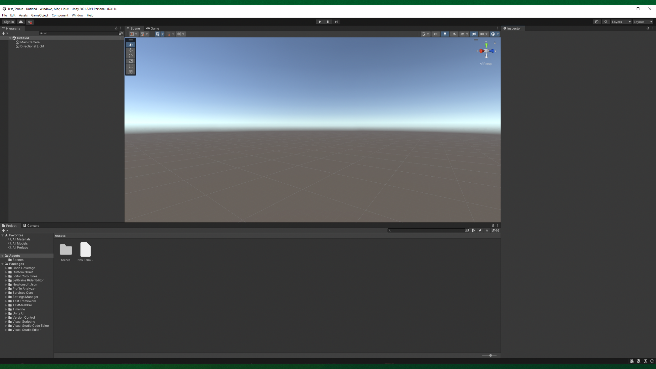
The Unity UI
And these are the main sections in its User Interface, the UI. Green is the hierarchy, yellow is toolbar, blue is the 3D view, purple is the property panel, and red is the asset browser.
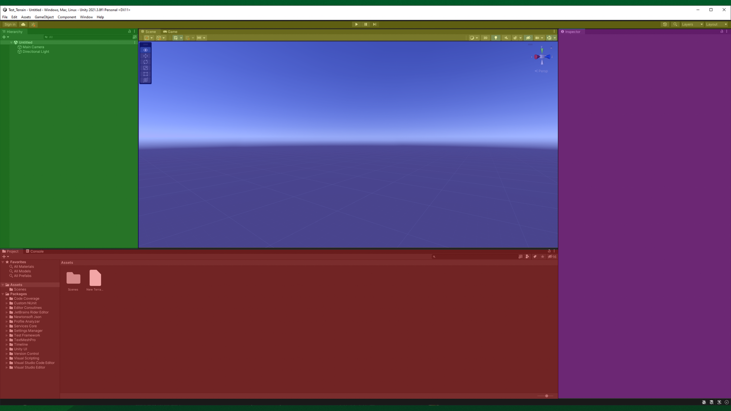
The Unity UI, now coloured by section
Here is Unreal. They have familiar sections.
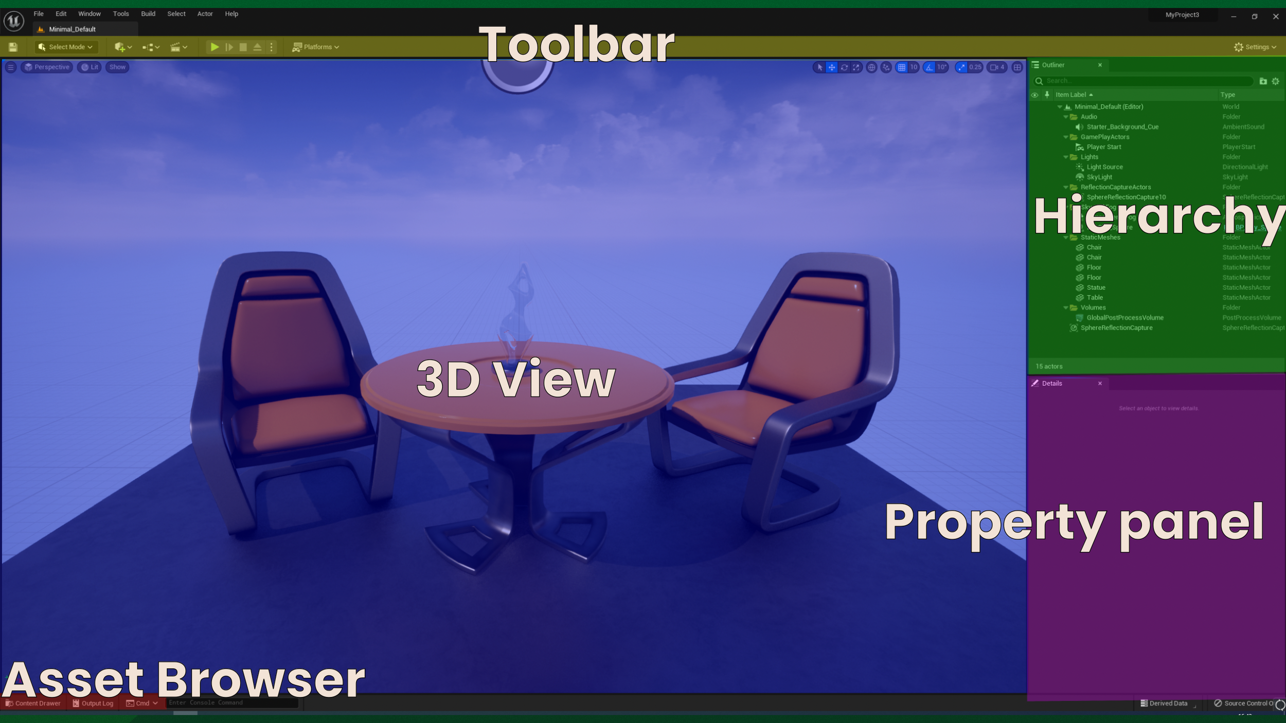
The Unreal UI, labeled and coloured by section
Though the hierarchy is on the right in Unreal. The asset browser is also in the bottom, but collapsed at first, and the property panel is only half the height of Unity. These UI sections are familiar to many Digital Content Creation tools, the DCCs.
Here is 3dsMax. Similar, yet different.
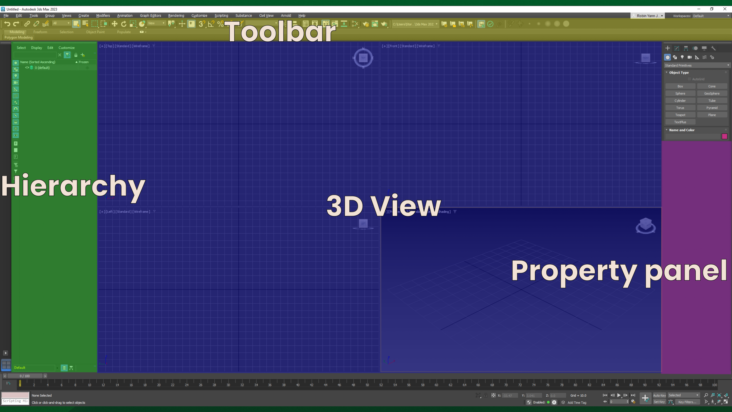
3dsMax with labeled and coloured sections
The hierarchy is back on the left again, the property panel is still on the right, and there is a thicker toolbar at the top. And, there is no visible asset browser from the get go.
Here is Maya.
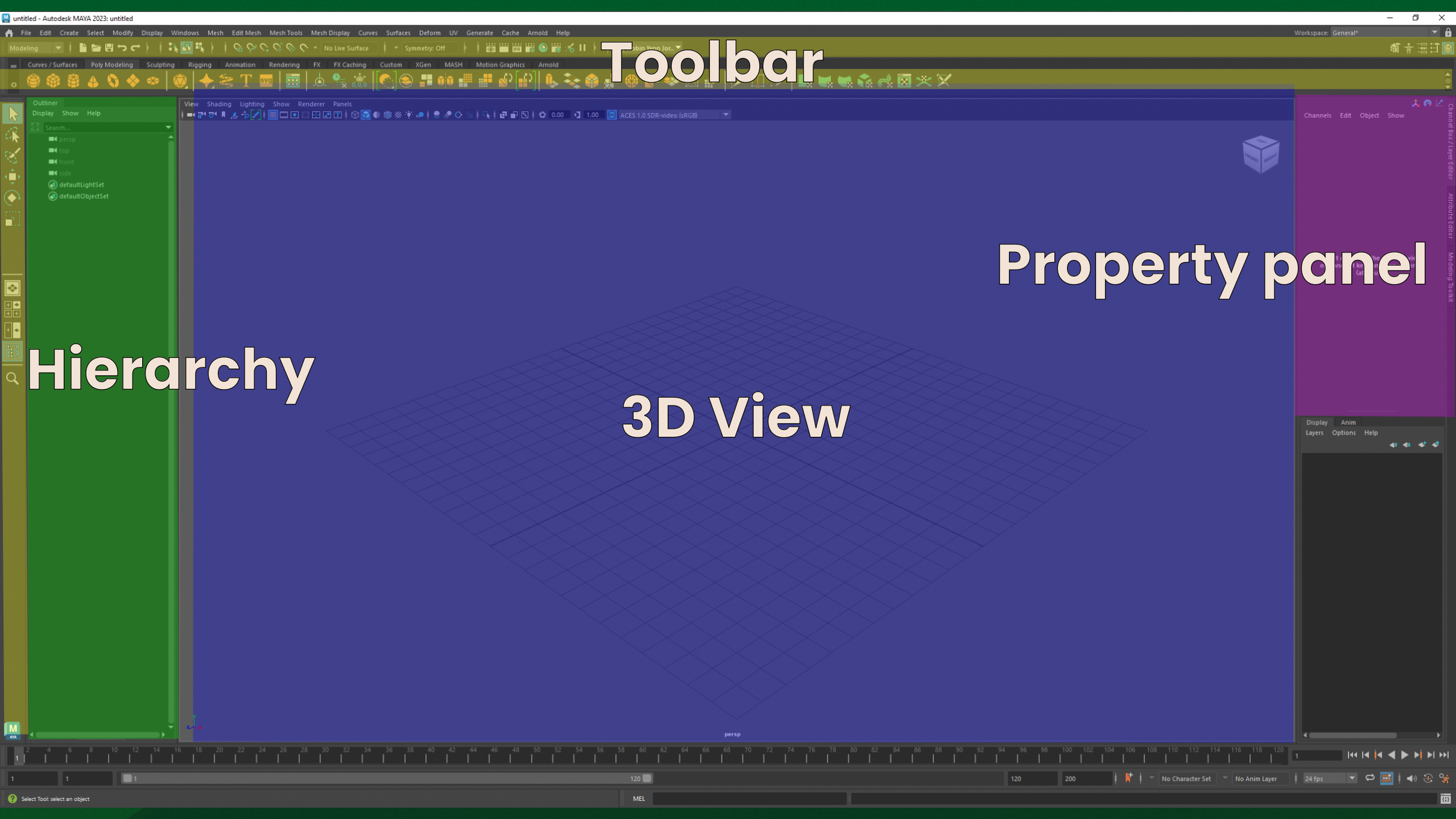
Maya’s UI, labeled and coloured
The hierarchy is still on the left, but there are many more toolbars now. Two rows at the top, and a row on the left. And, there is no visible asset browser.
Here is Blender.
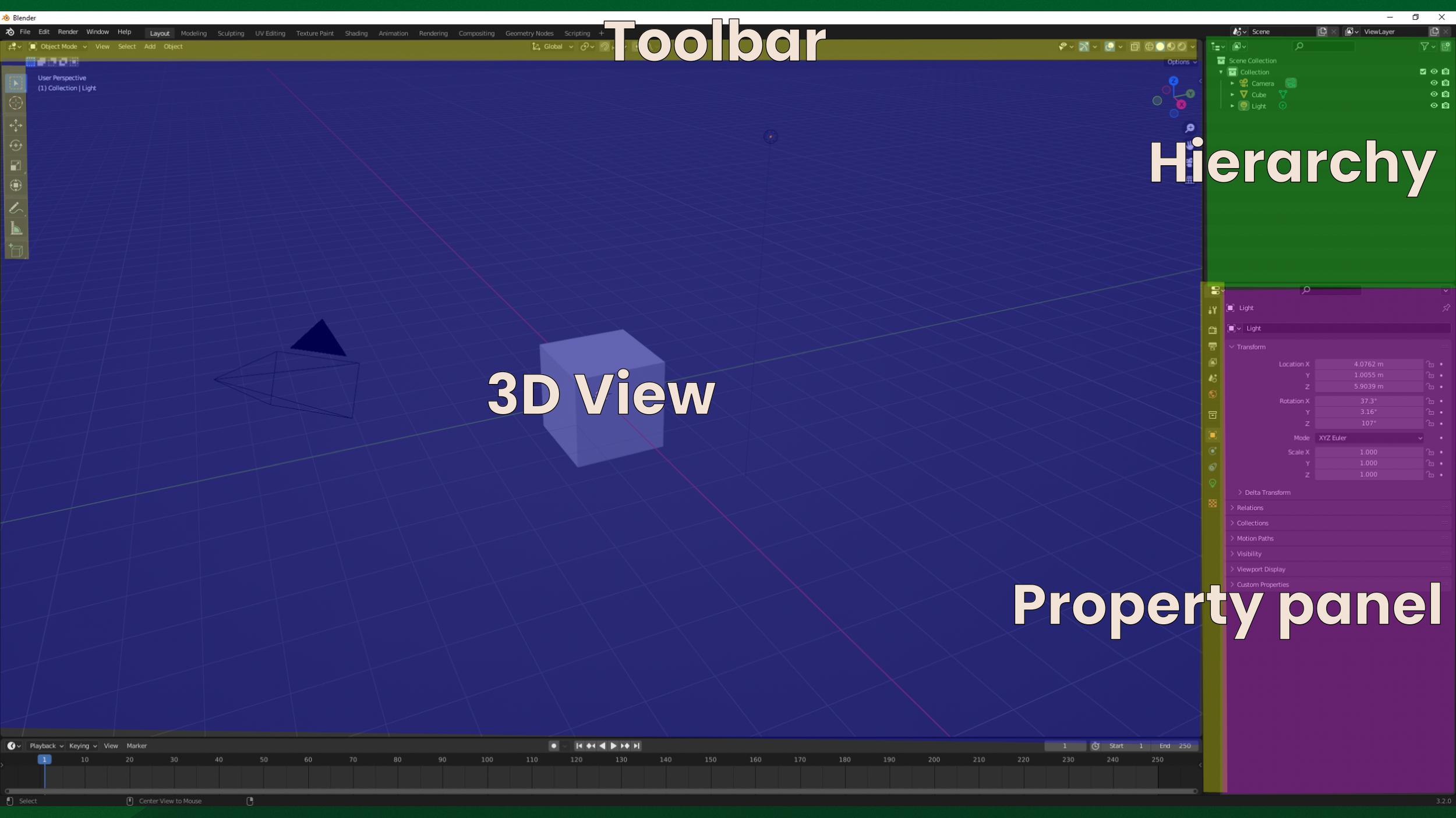
Blender’s UI, labeled and coloured
The hierarchy is now on the right again, and there are again a lot of toolbars, but no visible asset browser.
And the new hotshot on the block, Godot
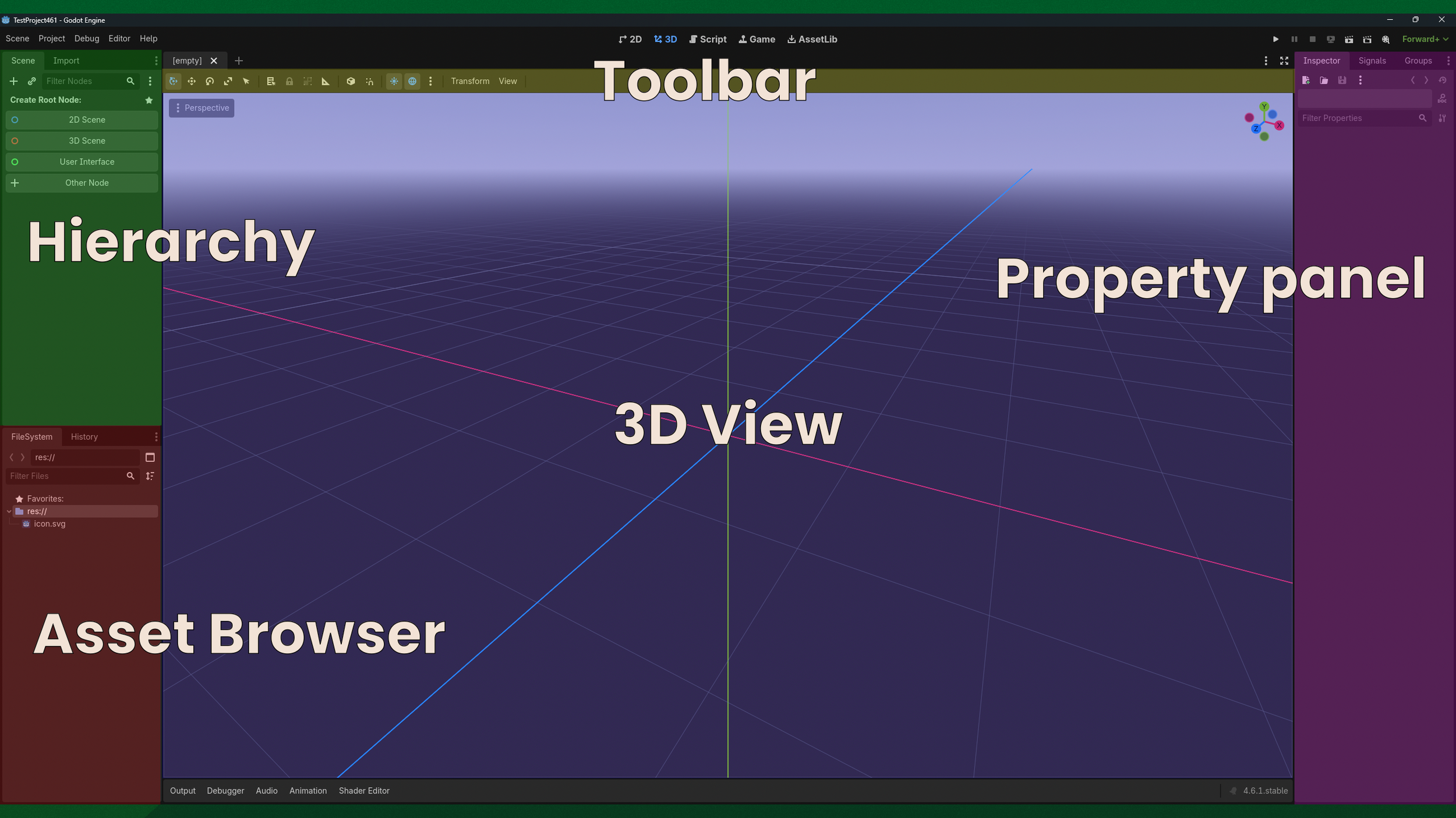
Godot’s UI, labeled and coloured
The hierarchy is back on the left, and there is only one toolbar, but the asset browser is immediately visible.
We can see that each editor has things in a different place by default. But, if you were to ask folks what the default of a 3D editor ‘should’ be, you will get widely different answers. Yet most folks consider these defaults sensible, which is why they are called…
Sensible Defaults
Basically: What is shown by default when the user first opens up a tool? Or, an editor, a DCC, or any kind of other software? What I want to tell you today is that there is no such thing as a sensible default. Calling defaults ‘sensible’ creates a bad thought process, makes your designs worse, and results in software that has a bad user experience.
Yet many folks use so called ‘Sensible Defaults’, why? There is an argument that I often hear, rooted in the idea of there being an ultimately good decision. Whenever someone tries to add customisation, someone will say: “You are failing to make a decision, and pushing the decision on the user.”, which is entirely wrong. I have worked in the video game industry for over 15 years, many of which as a tool designer for 3D editors, and I have seen what can go wrong when folks try to design ‘sensible’ defaults. So let me show you why the idea of ‘Sensible Defaults’ has to be crushed out of existence.
Now, to start talking about defaults, first we have to talk about averages, and there is no better way to do that then Todd Rose’s book: “The End of Average”. I highly recommend reading it. It contains many good stories about how using an average is actually a bad idea, which is a lot of what ‘sensible’ defaults are. There is one story in particular that I want touch upon.
In the book Todd Rose mentions that in the 1940s, pilots in the US airforce were having trouble. They had accidents and crashes way more often than was anticipated. Originally they figured this was pilots making mistakes. But that wasn’t the issue. It also wasn’t a mechanical or electrical failure.
Eventually, someone looked at the cockpit design. It was built for pilots measured in 1926, and then averaged down to that one size. So what was their proposed solution? Measure the pilots again! So they measured thousands of pilots, averaged their measurements, and then looked at how many pilots actually fit that average.
It was none. None fit the average.
To see how that works, let’s take an example, of the head, shoulders, chest, arms, waist, legs, and feet of two pilots, and the sizes of those body parts. Let’s say pilot one has a small head, small shoulders, bigger chest, smaller arms, bigger waist, smaller legs, and smaller feet. Pilot two has a bigger head, bigger shoulders, smaller chest, bigger arms, smaller waist, bigger legs, and bigger feet. So what is the average pilot? See the image below. Which neither of them fit to.
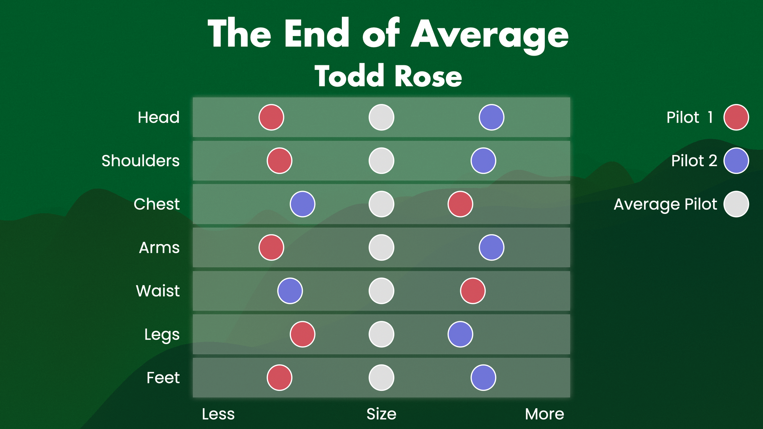
A visualised example of bodypart sizes for two pilots
Now you may think this is an easy mirror split of data, but even if the data is different, we can still see that each pilot does not fit the average. No matter what data we get, the average never fits.
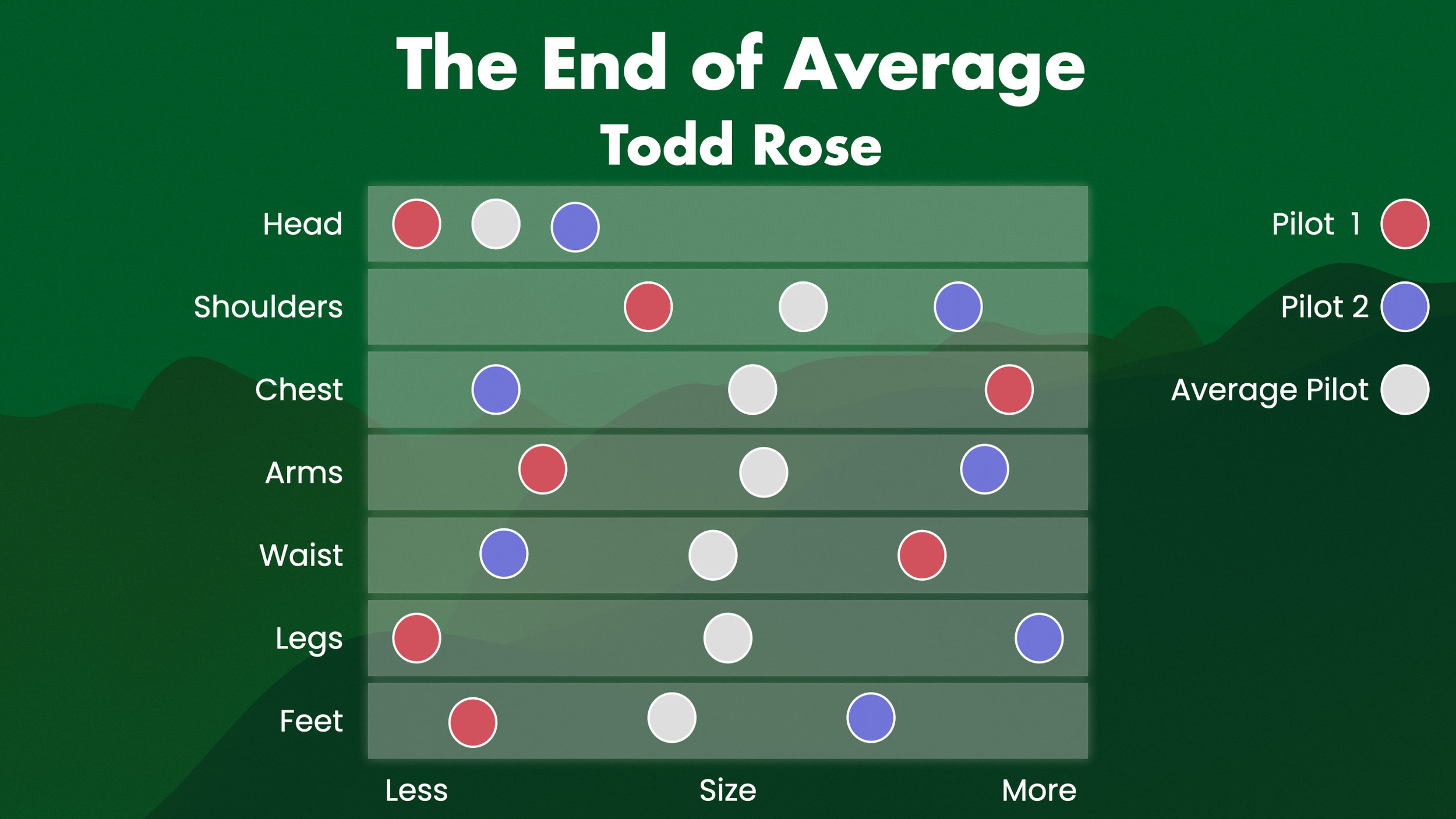
A visualised example of bodypart sizes for two pilots, with different data
So what do we learn from this? There is no such thing as an average pilot. And when something is designed for the average, it means it is fit for nobody. When the cockpit did not fit all the differently sized pilots, they crashed more often, because they could not control the plane as well. So the conclusion from this story was to allow the pilots to customise their cockpit.
Allow them to adjust the seat for leg length. Adjust the controls for arm length. So that the cockpit fits their body. They did, and pilot performance soared. Instead of neither pilot being able to sit and work comfortably in the cockpit. Pilot one can set their settings to fit them, and Pilot two can set their settings to fit them.
Again, “The End of Average”, by Todd Rose, a great book, and there are way more stories about how averages are bad, that you should read about.
Now you might be thinking “Hey, great story, but I’m not a pilot. I’m a game developer.” Except for a few rare few of you. Yes, I am looking at you Rami. But fine, what does this have to do with game development? Well, let’s think about your workspace. The cockpit that you, as a game developer, sit in. You have both a physical, and a digital workspace. Let’s start off with the physical.
Your physical & digital workspace
What do you adjust, in your physical space?
Your chair!
How high is it? Where are the arm rests? How far does the back go? How far is it from your desk? Is it soft, or hard? Does it roll, or not? You may have only set these settings on your chair just once, but in setting them it has prevented you from being in pain for years on end.
What is something else that you adjust?
Your screen! How bright is it? How far away is it? Do you use it horizontally or vertically for code?
Your keyboard! How do the keys feel? Does it have a numpad section, or not? Some people love those, others would rather do without them. And do you have a QWERTY or AZERTY, or maybe even a DVORAK layout?
What is the binding element in all those examples? You! You are unique, and so you have to adjust that physical workspace for yourself. You use the options available, on the physical devices around you, to make them fit yourself. Just like how you should do with your digital workspace. Like we saw with all these DCCs that are slightly different in their own unique ways. None of which are necessarily right, or wrong.
Because it all depends on so many more parts that are unique about you, and your project. Like your studio, your country, your manager, your tools, your language, your culture. All of them influence how you work, and it means you sometimes have to customise how you work.
Every person is slightly different, in their physical workspace. Every editor is slightly different, in their digital workspace. And even within workflows, your needs constantly change, requiring you to adjust.
Let me give you an example of two level designers. Different level designers use different tools more often in their workflow.
Let’s say we have a bunch of tools, for geometry, materials, narrative, sound, 3D Art, Lighting, and scripting, and how much those are needed in workflows. Level designer 1 is a environmental narrative storytelling person, with particular needs shown in the image below. Level designer 2 is a combat and visual oriented person, particular needs shown in the image below. So what is the average level designer? Right there in the middle of the image, and of course, they do not exist.
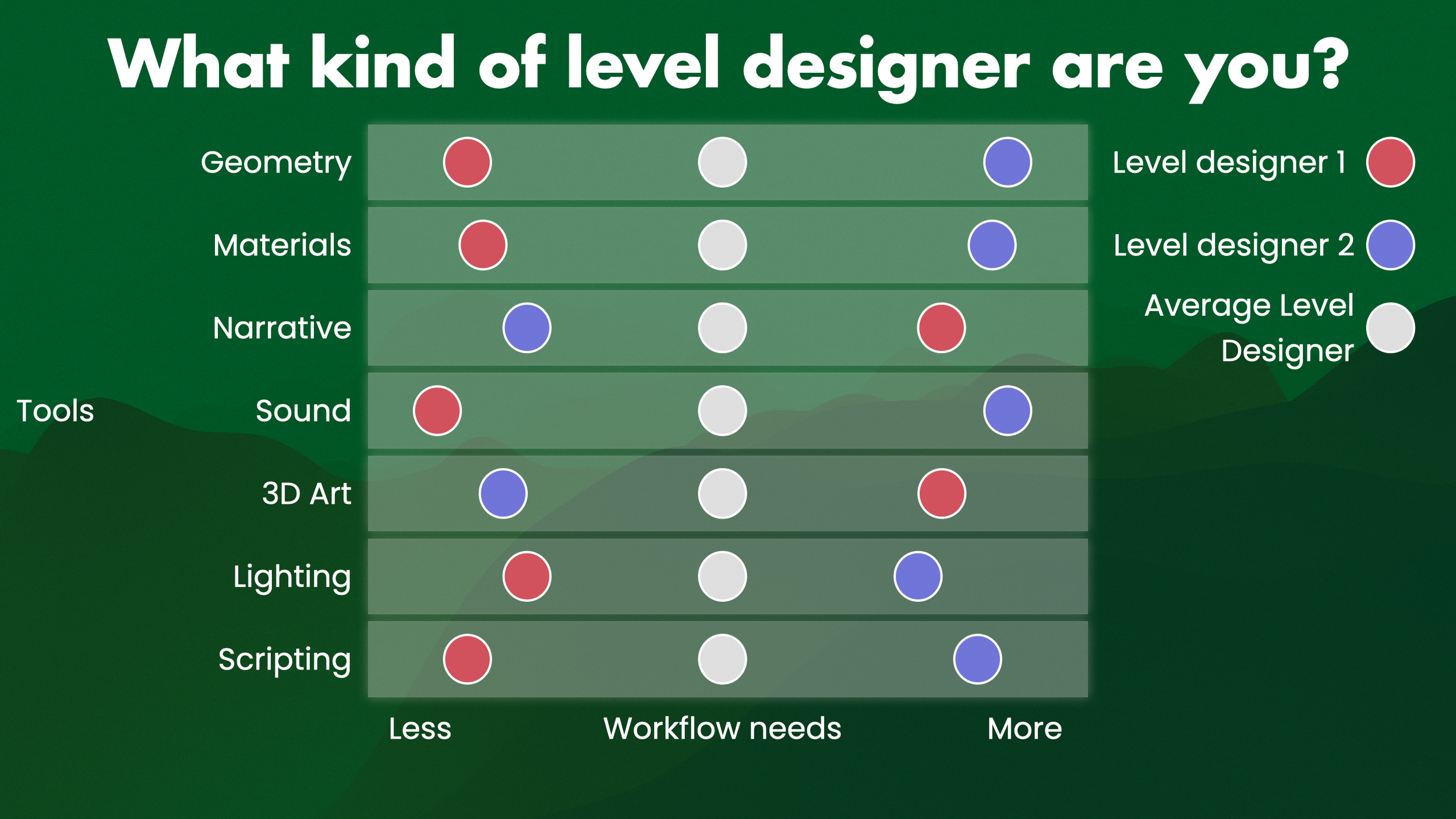
Two level designers, their workflow needs, and the average level designer
Different people have different needs, depending on the work they do. In fact, this even changes when one person is working on one area. Let’s say we need to grey box a village in a video game. That takes a lot of geometry work, a little material work, a little narrative work, some sound to make it feel good, not a lot of 3D art, but a bit of lighting, and a little scripting.
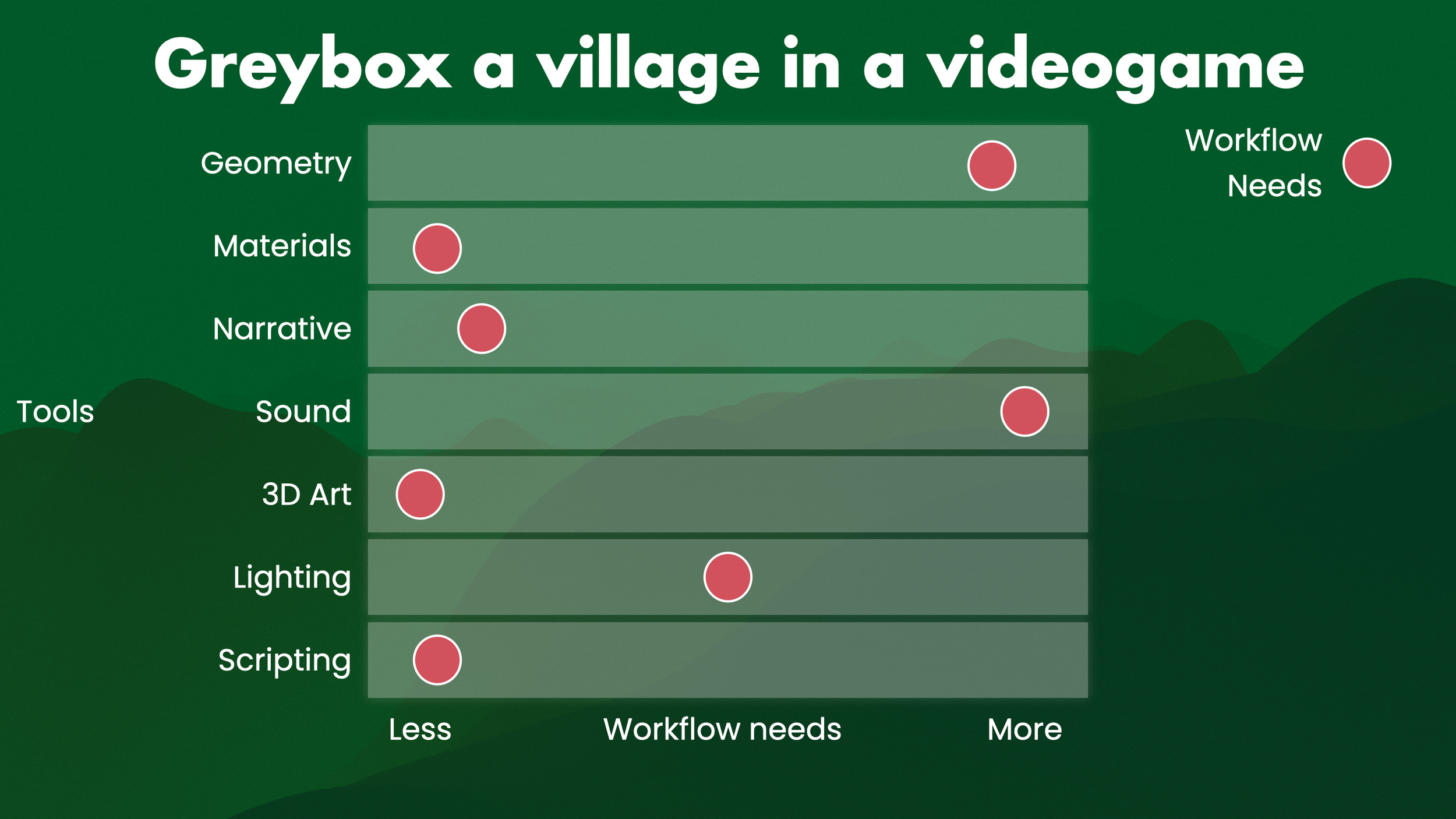
The hypothetical workflow needs of greyboxing a village.
But now, what if you want to polish the area?
Our needs have changed. We need more material and 3D art tooling, and less geometry tooling.
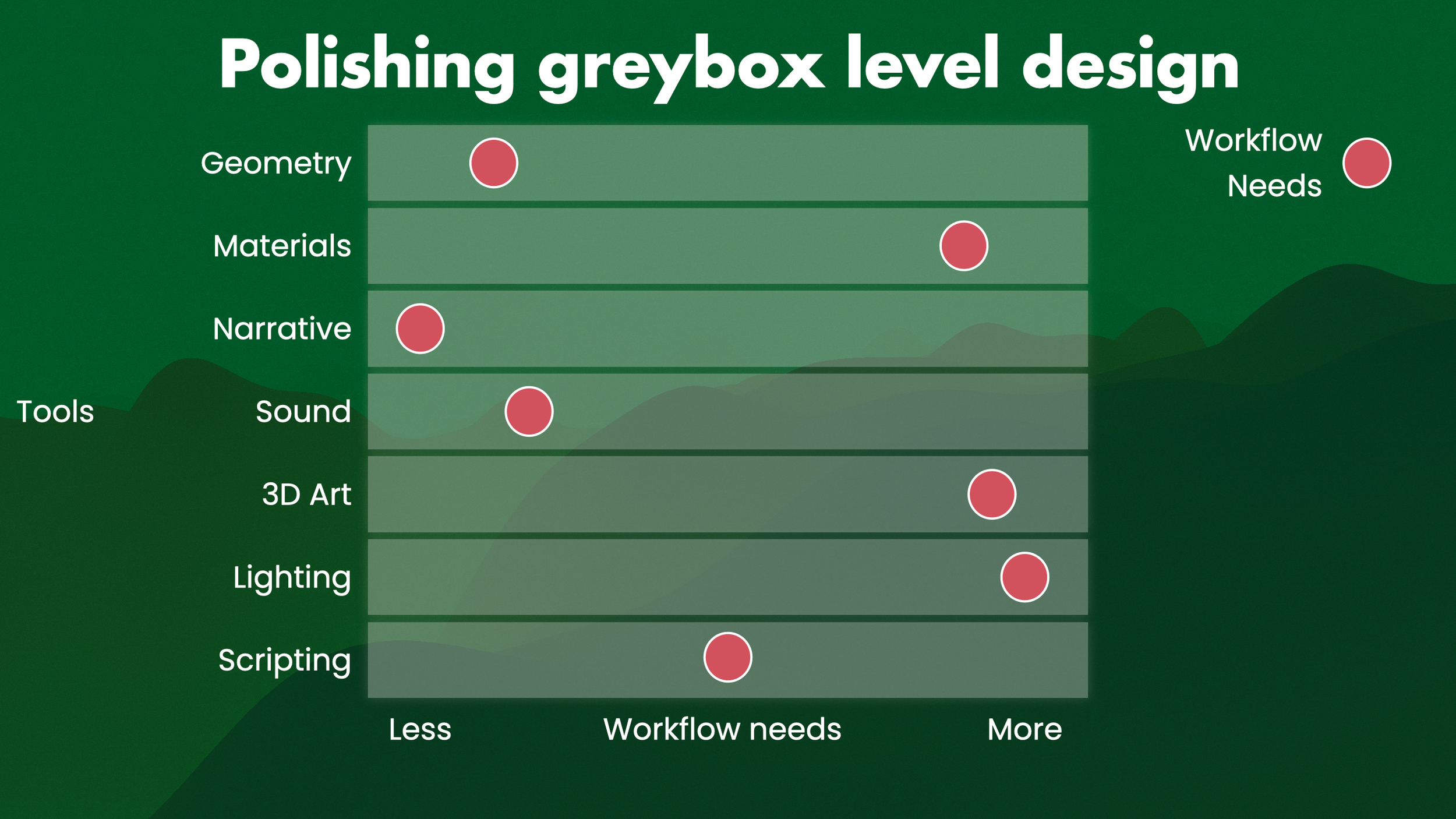
The hypothetical workflow needs of polishing a greybox level design
Now a director comes in after some playtests, and they say: What if a friendly NPC gets added after combat, that the player can talk to?
Sure, and again our needs change.
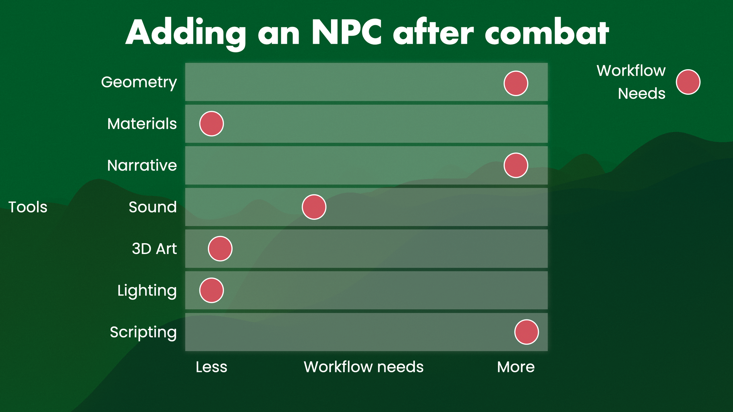
The hypothetical workflow needs of adding an NPC after combat
So even one level designer working on one area, has different needs for their tooling over time. People, projects, roles, studios, all of them are unique in their own special ways. There is no ‘Sensible Default’ that would require all of them to look, feel, and work, the same.
So, do not think of defaults as ‘sensible’. If you think of them of sensible, you are averaging down, and assuming that the average is ‘correct’. It isn’t. As we have seen, averaging down can be disastrous! Instead, think of defaults as editable. There is a default, there always is some initial setting, but to what can the user change this setting? Consider that, instead of a nonexistent ‘sensible’ average, and you are on a train of thought that leads to better user experiences.
Also, especially if you are a creator of tools, you do not get to decide what is a right or wrong workflow. Your users get to decide that.
(Keep that in mind, Linux community! Whenever someone asks a question and any of you say “Why would you do that?” most often the answer is that someone simply has a different way of working, that works well for them. This means as a developer, you do not always know best. Yeah, crazy right?)
So, alright, we know we need to allow users to adjust their software. How do we do that? Let me show you some examples of what is, and isn’t editable, in various digital workspaces. When you are always working in Unreal, or always working in Unity, you may forget how other editors work, which is reasonable as you are always working in one editor for longer projects. So I have some examples of both things that are good, and things that could be improved, you so can get a sense of how useful it is to simply look around at what is out there.
Here is an example in Unity. We can get a list of overlays, and then easily turn various parts of the UI on, and off. We can also easily drag parts of the UI to different places. We can do this with floating toolbars, but also regular toolbars. It shows a visual of where the UI will be, making it much easier to see what your UI will look like before dropping it in. We can of course also drag various parts of the UI around, even the very large parts. We also have choices of a couple of defaults, such as 2 by 3, and 4 split. Custom layouts can also be saved, and shared, with others. One thing I really like in Unity, is their keyboard customisation UI. It literally looks like a keyboard, so you instantly can see what keys have a command on them, and which ones do not. This makes customizing your hotkeys much easier, faster, and nice to remember.
Unreal Engine also allows for customisation. For example, you can turn on this FPS counter here. But, I cannot click and drag any of those toolbars around. I cannot quickly and easily place them in different locations, if I wanted to. I can hide the entire viewport UI though! But that viewport UI is different from the FPS counter, so now I can no longer turn off the FPS counter… so I have to turn it back on to be able to turn it off. Not great. Clicking and dragging elements around is pretty nice though. It clearly shows where the UI will land, and where the UI can be placed. The ghosting of the different placement areas, before even dropping any UI in, is super clear, and gives feedback to the user on what their action will do before they even do it. You can also change between different modes, which makes various UI parts appear, but you cannot just click and drag these into the positions you want them, for example: To put them in a toolbar. This makes it so the user has to constantly change between modes to see their preferred buttons, which I think Larry Tesler wouldn’t be a fan of. Also the hotkey list is… just a giant list. It’s hard to see what commands are set where, and which keys are already taken. Customising hotkeys becomes a very unclear chore because of this UI.
Next, Blender! We have a lot of different modes by default when we start out, which Blender calls Workspaces. These have different UIs for different workflows, which is great! Sadly, again we cannot click and drag the toolbars around to customise this UI more. So we cannot easily and quickly set up the toolbar we want, in a simple way, which is a shame. But, if we go into the menus here, we can right click each one we want, and select ‘Add to Quick Favourites’. We can even go to the side here and add the transform gizmo to the quick favourites! Neat! Then I can simply press Q, and the quick favourites menu opens, with the exact options inside it that I have selected. I can then access them and perform them instantly, which is fantastic. Shortcut wise Blender has their own hotkeys, and the industry compatible hotkeys, which is nice. Again, there is choice provided. Sadly there is no visual of a keyboard though. But! If I change to the industry compatible hotkeys, and then press Q, nothing happens. I do not get the quick favourites menu. Alright, so let me look up the hotkeys on the documentation and… it just says press Q. It does not show what the hotkeys are for the industry compatible hotkeys, and there is no way to switch to those hotkeys in the documentation. I think it would be best for users to be able to save their hotkeys to a file, upload that to the documentation, and then it shows them exactly what their hotkeys are for each feature in the documentation!
Editing the software for daily usage is so important, and these edits can be both big and small. Here is an example from Maya, where we can adjust the individual parts of a gizmo! All of that is adjustable, in case you need it.
This is not just UX in the classical sense, this is also accessibility. The larger and thicker gizmo can be much easier to see for some users.
Here is another one that I love in Maya: The Maya Shelf.
You have a whole bunch of default shelves, each with their own purpose and workflows. User can choose which one they need at any time, and they all have lots of options. But, we can also make our own shelf, which I will do right now. I can then go into the options menus, and simply shift click to add them to the shelf! So whatever features I use most often, I can decide which ones to place in my own shelf.
This is incredibly powerful! It allows you to fully set up your own workflows, depending on the work that you need to do often. I love the Maya Shelf.
And if you work in the AAA game industry, you will have a specific one at your studio. It was made by a tech artist 15 years ago. It has been shared it with everyone else, and now every artist uses it. And it is recommended to anyone who joins the team. It is critical for the pipeline, as if any tool in there breaks, the pipeline breaks. And you know what, that tech artist who made it doesn’t work there anymore. I know you have one! And they allow for a customisation of workflow.
Anyway, as we saw, some of these giant editors with hundreds of tools cannot be customised in easy ways. So let me show you a much simpler app, which has this figured out like a charm: Keynote. I used it to make the slides for this video.
In Keynote I can simply right click the toolbar, and then select customise toolbar. All the options for toolbar features then appear, and I can simply click and drag features off the toolbar to remove them, and drag features on to add them. This way I can always easily see what I want to click, and do not have to remember all the hotkeys if I do not want to. And, if I ever want to go back to the default toolbar, I can simply drag it on, and reset it. This customisation workflow is a part of the basic macOS UI system, so any app can have this customisation, so you can also use it in Safari, Pages, Numbers, etc. So basic macOS apps allow for drag & drop customisation, yet giant DCCs do not? That is strange.
Now you may think a giant company has an easier time adding this kind of customisation. Maybe, but, Audacity 4, in the latest release, also added toolbar customisation. Made by a small team, and open source. They added a simple dropdown menu in which you can turn buttons on and off. Not quite drag-and-drop, but still a great direction for customisation.
This customisation is so important because everyone is slightly different, but correct in their own way of working and thinking. It is like people who say they like playing with mouse, and keyboard. Some folks will be like: Yeah, Sure, but others will say: No way!
Then there are folks who say: I like playing with a controller. Some will say: No way! But others will say, sure, and yeah.
The critical thing to understand here is: You are all correct. Multiple things can be true at the same time. That is life. This also goes for when people talk about ‘Best Practices’. There is no such thing as Best Practices. There are practices, and some of those are best for you and your project, and some are not.
Let me give you an example: ‘Agile'. If you have seen it save your project, you will want to apply it to everything around you. If you have seen it burn out your team with infinite backlog grooming, you will never want to use it ever again. The thing to understand is: Both views are correct.
Projects, teams, leadership, there are so many variables at work. You need to customise your practices into what works well for you. If there were all-encompassing universal best practices, then every single giant successful company would be working in the exact same way to finish each project on time, to quality, with guaranteed successful results each time. That’s fantasy. You have to customise the practices to fit what works best for you.
Customisation also allows you to work faster, better, and more efficiently. And the fun thing is: Workflow customisation is also applied in games! World of Warcraft is a fantastic example of allowing users to customise their UI in ways that they want. I can turn additional hotbars on, and off. So we can see them appear on various parts of the screen. I can then grab any spells, or abilities, for my character, and drag them onto the bars. So I can have visible, and reachable, what I want visible and reachable. There is also a dedicated Edit Mode, which allows me to move the UI around anywhere on the screen. I even get redlines and snapping so that it is easy to set the UI up. There are dedicated UI sections, such as timed boss abilities, that have many different settings for themselves as well. Some of this customisation is functional, such as setting the hotkeys, and some can be aesthetic, such as making the hotbars centred in the screen. I am also able to expand and shrink these various sections to exactly how I want them to be. And this isn’t even the full customisation that is possible. There are mods like ElvUI and WeakAuras that allow for complete makeovers. And I can then save the layout into a profile, to easily go back to the original default, and back to my customised UI.
High level raiders in World of Warcraft create their own custom UIs to be as hyper performant and efficient as possible, to perform incredible feats, such as Team Liquid’s world first of Midnight Falls. They are professionals, playing many hours every day. They have customised their software for their optimal performance. Even within the same guilds, different players with different classes have different UIs that work best for them. Again, consider that: If your players are allowed to customise their UI for optimal performance, how in earth are your tool users not allowed? That’s nuts!
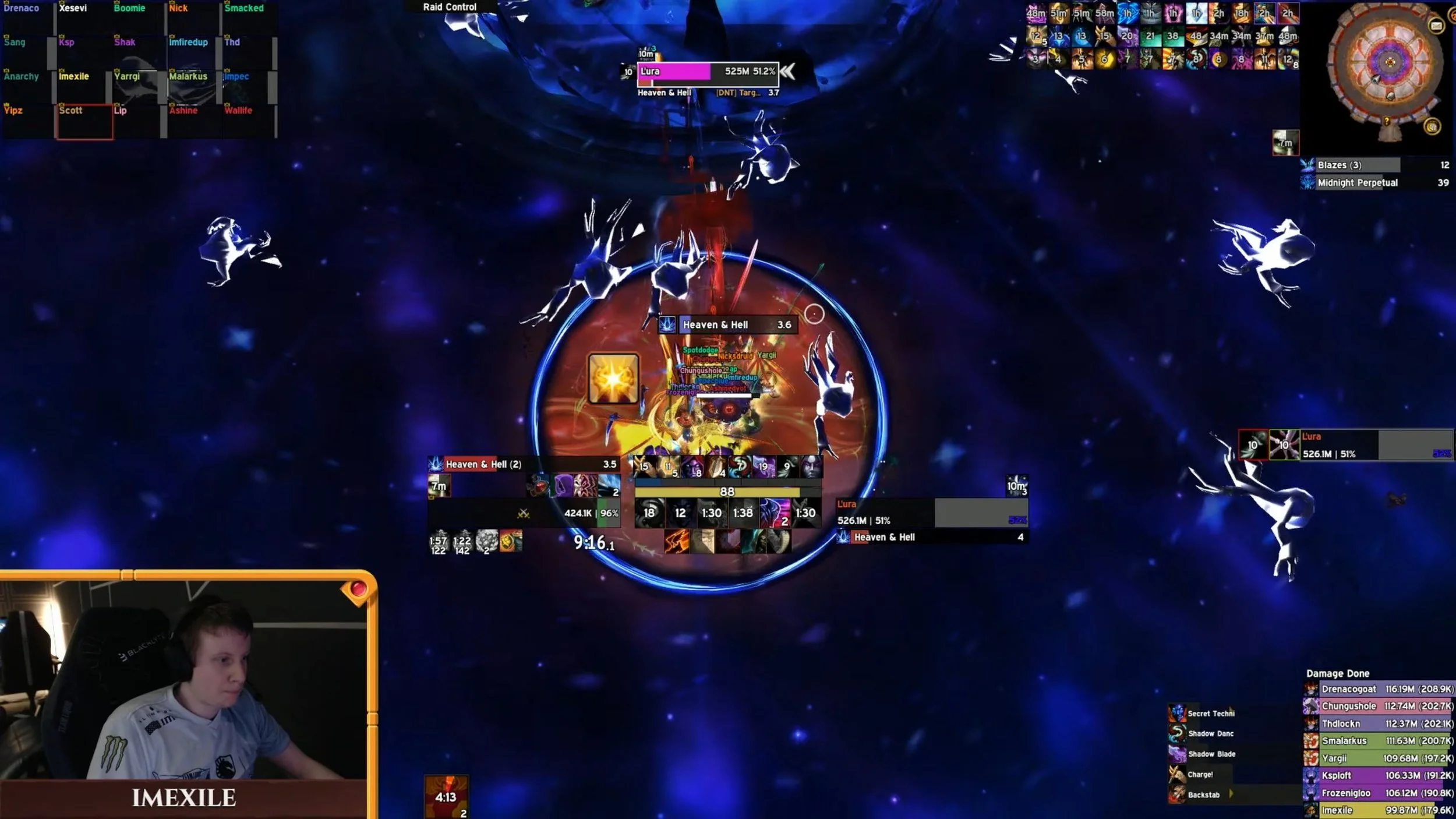
WoW raid custom UI, from Team Liquid MMO - Youtube - Liquid vs WORLD FIRST Midnight Falls
Some other players, perhaps not world first raiders, go for an aesthetic route.
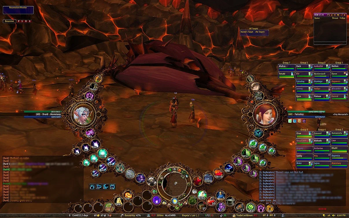
A particularly ostentatious UI, from Mantraz, r/wow
Imagine warnings showing up in a 3D editor like they would for a professional WoW raider, clear, spatial, and to the point, with icons and color on an asset with an issue, instead of just a line of text in a console that instantly scrolls away. But, that’s a whole other video for another time.
There is another important aspect to consider here: Functional vs aesthetic changes. The difference between functional vs aesthetic is hard to measure, and differs per person. For example, light mode vs dark mode. Some consider this an aesthetic change, but depending on your own eyes, you may prefer one over another for accessibility reasons, so it becomes functional for you. So letting users set their own visuals, and their own functionality, is key. They can decide what is functional vs aesthetic, this is not a decision for you to make.
But you might wonder, rightfully: “If the user can customise a UI so they have access to everything all the time, doesn’t that mean they have a busy and complex interface?” Like this view in Blender, isn’t this bad? So many buttons, tabs, etc.
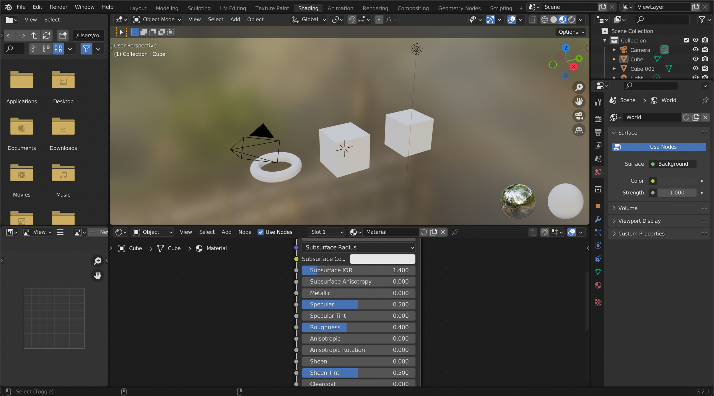
A view of the Shading workspace in Blender
I am not saying this is perfect, but it also isn’t necessarily bad. For example, Unreal made a big change in their UI. UE4 had a lot of functionality shown in its UI, which can look complex and chaotic at first.
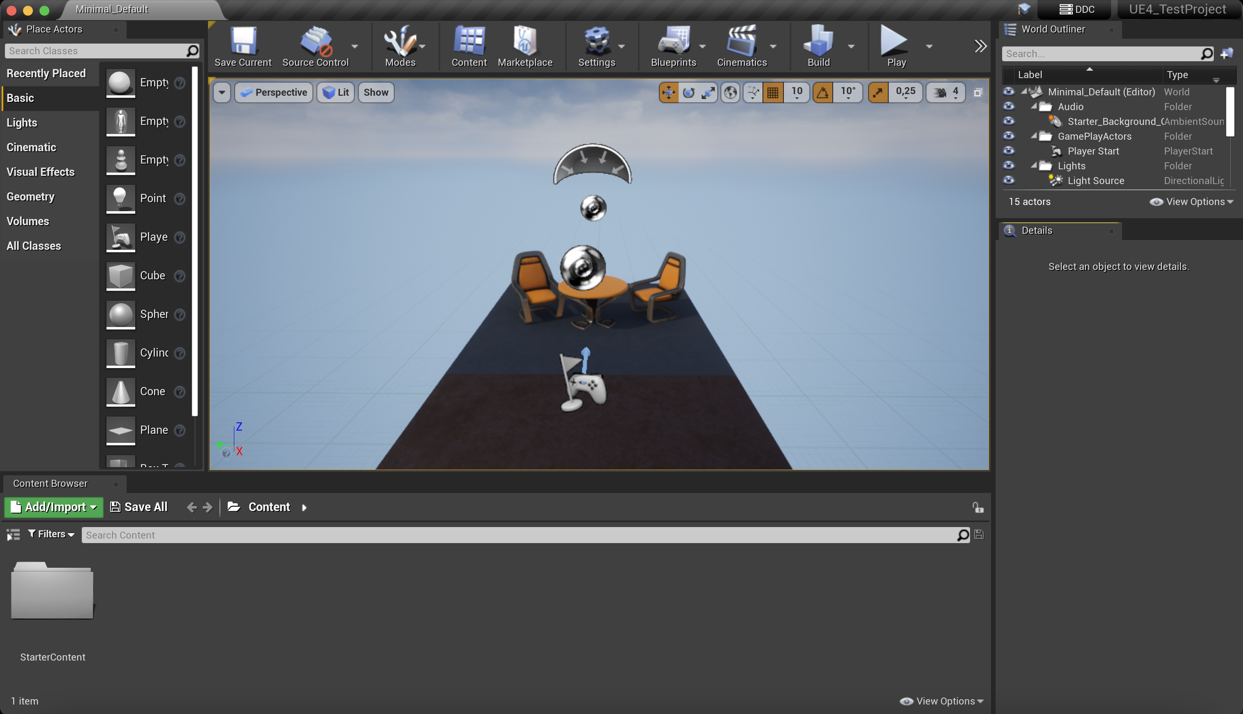
The UE4 UI
UE5 cleaned that up. Much less buttons readily visible.
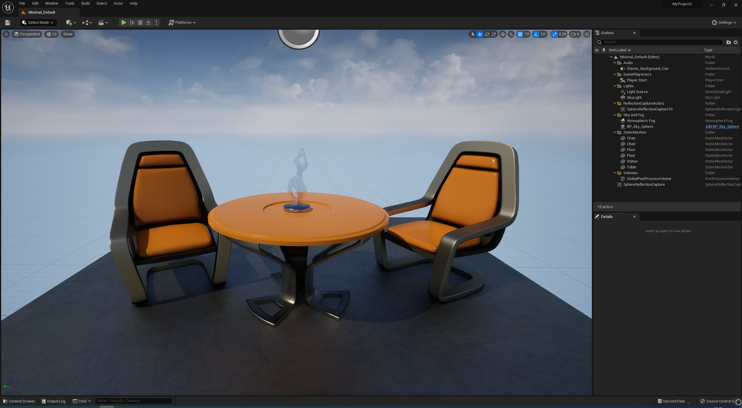
The UE5 UI
Which may be good for new users, but professionals still need to access everything they want quickly. Like I showed earlier, in Unreal I cannot just drag and drop a toolbar together like I can in Maya So this new UE5 look is different, but not necessarily better for professional daily use. And to talk about that, let’s go back to…
Airplanes. Again.
In an airplane’s cockpit there are a whole load of buttons everywhere. It is overwhelming. How do you know what to do, and what to touch? If you are not used to this setup, these buttons, or know how it works yet, then it will look chaotic in your eyes. If you are not a trained pilot, you will not know how to start up the airplane. And if it is already flying, you will likely crash.
Yet at the same time…
Each single button, screen, section, is there for a reason, and has a particular purpose. The cockpit is a highly professional tool and environment to work in. However, when you first start out, you don’t get to sit in a cockpit like this right away. First you get trained on the console, the stick, etc. You’ll spend hours having to practice before even going into a simulator, and then many more hours until you get into the real cockpit! So there is a lot of time and training to get to this point, and at that point, the cockpit is a fantastic tool for which you know every button.
…not that it isn’t always entirely clear. If anything changes in the software or buttons of the plane, the pilots should be properly informed.
To take this analogy one step further: It’s not like as a pilot you can just switch between an Airbus and a Boeing airplane from one day to the next. Or even between Boeing airplanes like from a 737 to a 777! That still takes training! There is a learning curve, and some of your skillset will ease that curve, but the tools are different even if the workflow is similar.
Yet, in most software, we are expected to flip between Shotgun, or wait… it was changed to Shotgrid. Or wait, it’s Flow Production Tracking now. Things change fast in software.
And you have to use that together with Confluence, Blender, Slack, Jira, Miro, and many more.
So in your daily workflow you have to move from one to the other, and the other, and the other, and all the way around, constantly changing your UI and what you are looking at. It can be very frustrating, especially if the UI is very different between each of these, and if you cannot easily customise your workflows to fit your needs. This is also why it is so important to think about workflows, and not just tools.
For example, for 3D tools, do not think of the geometry tool, the shader graph, the scripting tool, the terrain tool, the lighting tool, and the dialogue tool. While they each may be built by different teams, and even have separate codebases, to users they will never be seen like this.
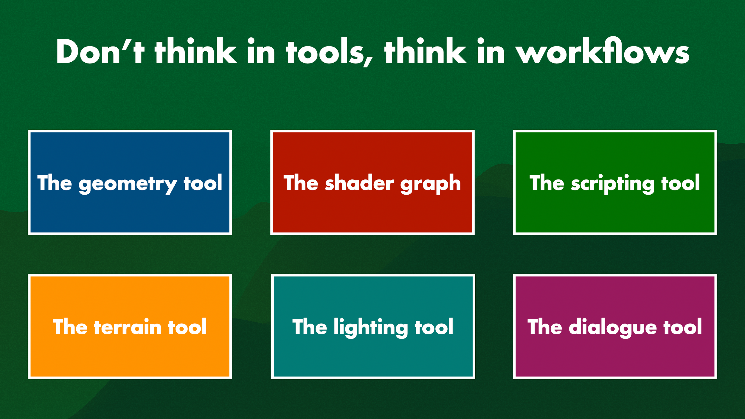
Various tools, in various colours
They will be seen like this. With a blockout workflow.
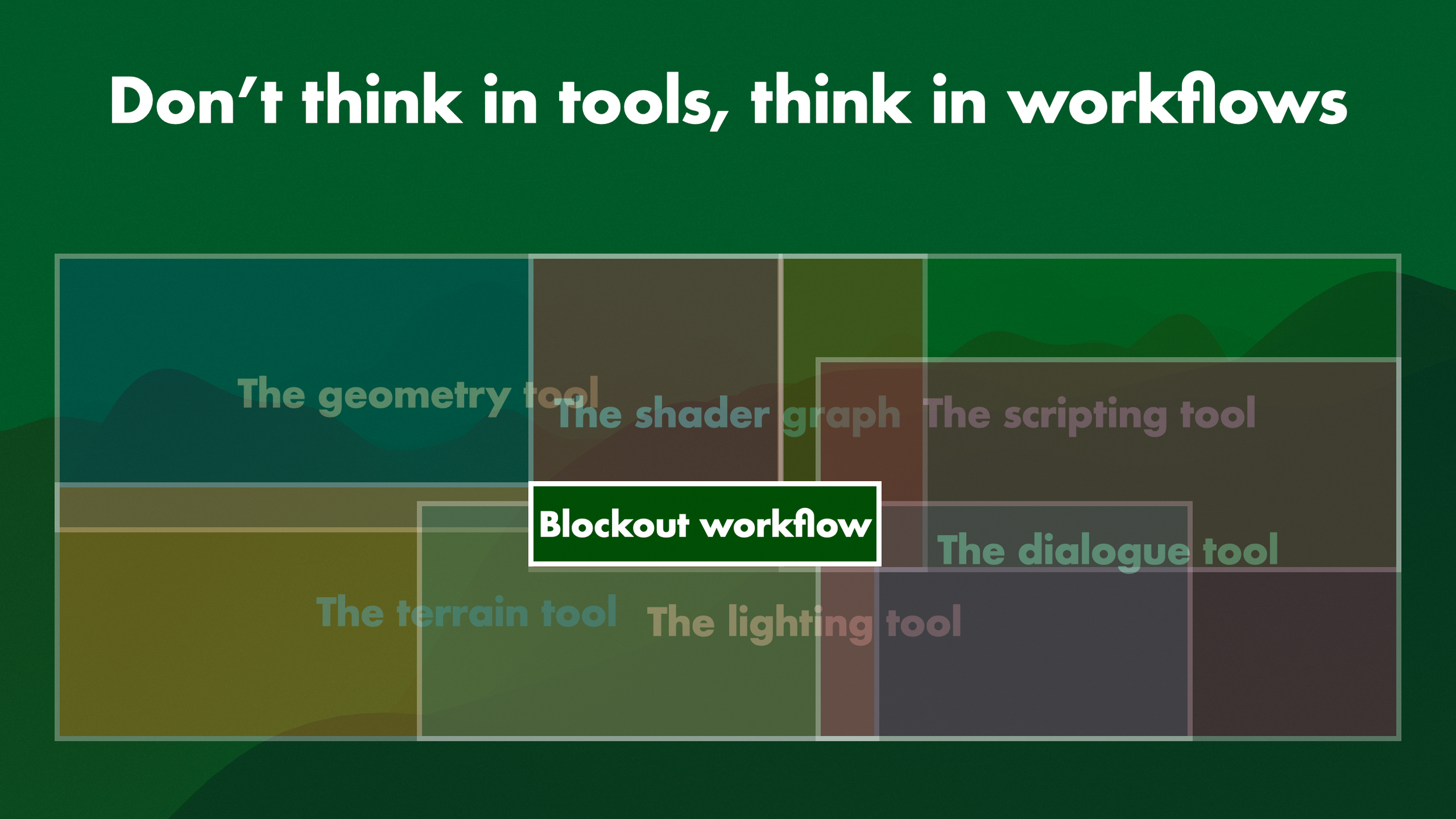
A workflow, made from the overlap of tools
This also goes for a narrative workflow, an art pass workflow, or a cinematic workflow. The tools get used, in workflows. So allowing users to set up the tools in their own way, creates the best workflows for them.
Especially if folks are going to be working in this tool for 8+ hours a day for 4 years, why wouldn’t you improve their efficiency? Customisation is needed. We give players who play our games a hotkey customisation menu, subtitles, accessibility settings, even adjustable UI, for 100+ or even sometimes even just 15 hours of gameplay. And yet the folks who spend over 2000 hours building those games don’t get to customise their software? That’s nuts, right?
Even existing tools can use updates to their customisation. Blender’s 2.8 changes are a great example of this. Blender 2.7 used to look like this. The classic grey UI.
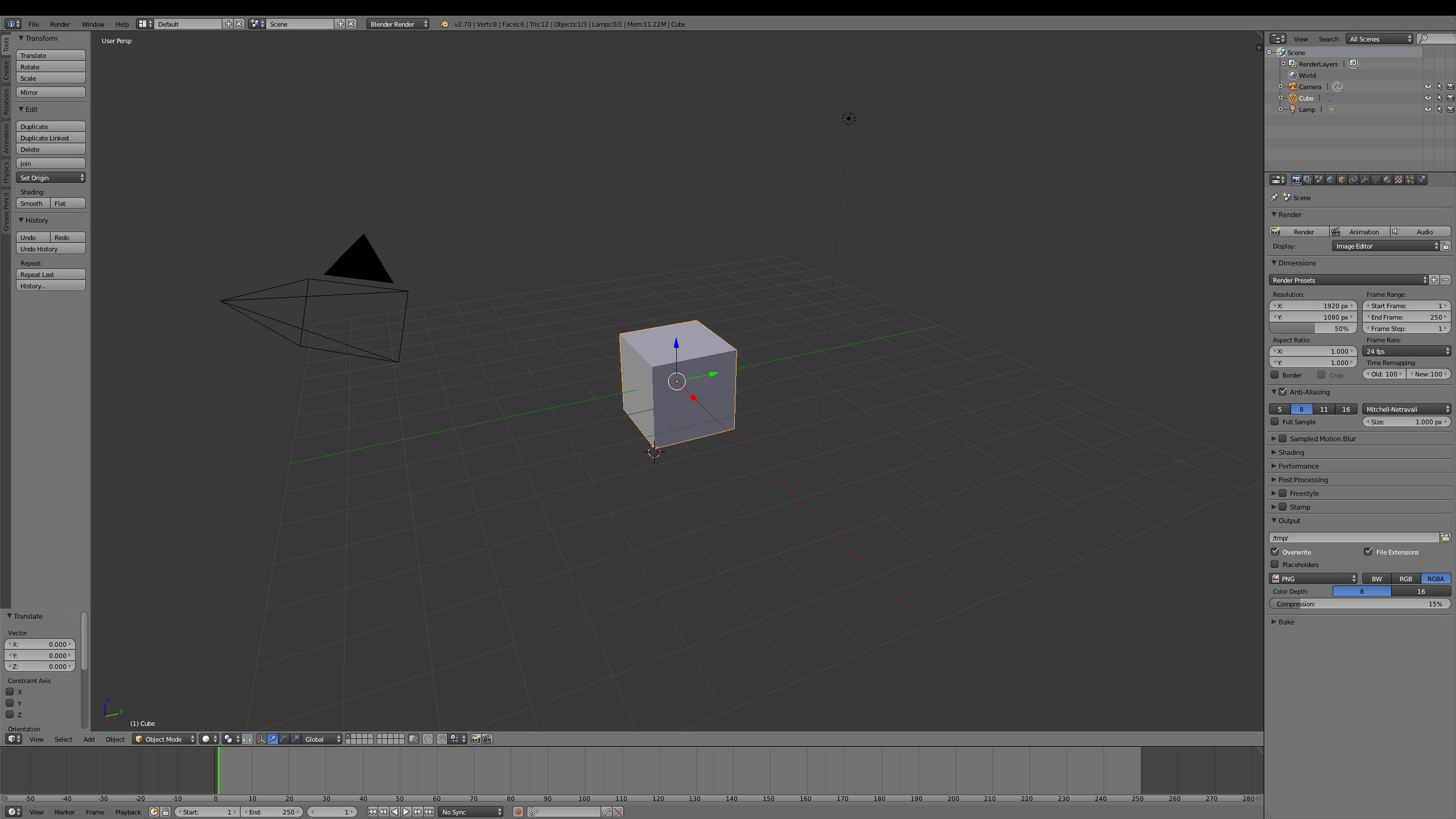
Blender 2.7 UI
But one of the most crazy things about it is that selection used to be right click. Not left click, like all other software out there! Oh no, it was right click. This, and other issues, is what established Blender’s reputation at the time of being extremely hard to learn. This was way back in 2014 and before.
But, with Blender 2.8 a huge change was made to the design, which finally also made left click the default select. But wait, didn’t I say sensible defaults are bad? This is a default change, right? Am I disregarding my own advice? Remember: You are all correct. Depending on how you like to work, and what works well for you, you are correct. The fault Blender made was considering right click select as a ‘sensible’ default. It should have been an editable default. Ask the user!
Which nowadays, they do! When you first start up Blender, ever, it asks you: What language? What theme? What keymap? And, what mouse select, Left, or Right?
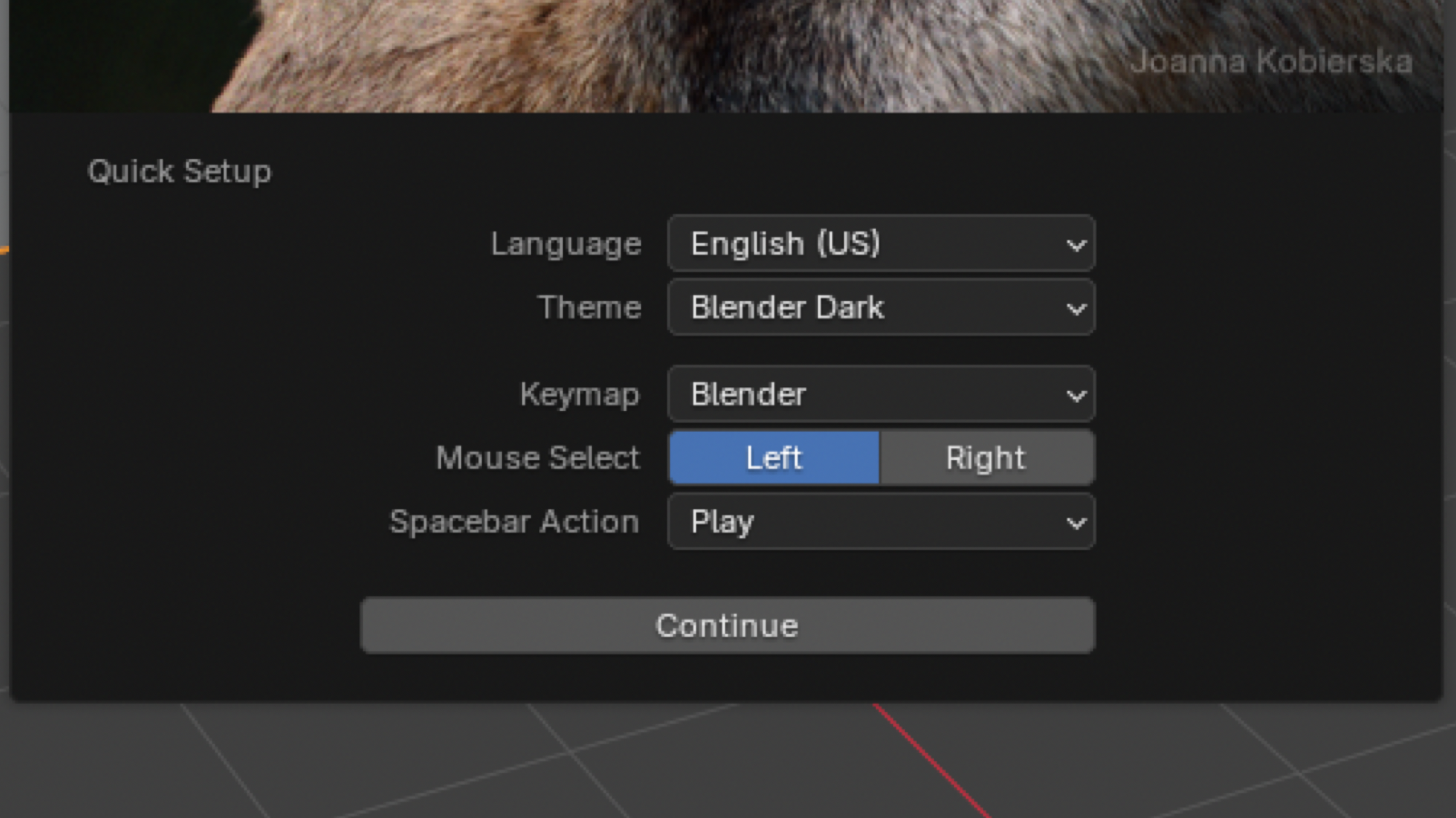
Blender user choices on start
And asking this is not a sign of failure! It is a sign of good UX, for professional daily software. Often, asking the user what they want creates a lot of pushback within a team, especially the programmers. They ask: “Should all software be easy to use for everyone?”, and that is like asking: “Should all office chairs easily fit everyone?”. No, they should not be, not without some adjustment being necessary. There are always tradeoffs to be made.
But for professional daily software, the tradeoffs are a bit different than usual. The UX will be slightly different. It is the difference between simple UX and complex UX. Let me give you an example.
Here is some simple UX, of a flight booking app. We have a phone, and the options we need are fairly simple. The user knows they want to depart from an airport, and arrive at an airport. They also know when they want to arrive, and when they want to depart. …that’s it. The user knows the desired end result: Go from one place, to another, and back, on particular dates. This, is simple UX. The user knows the desired end result.
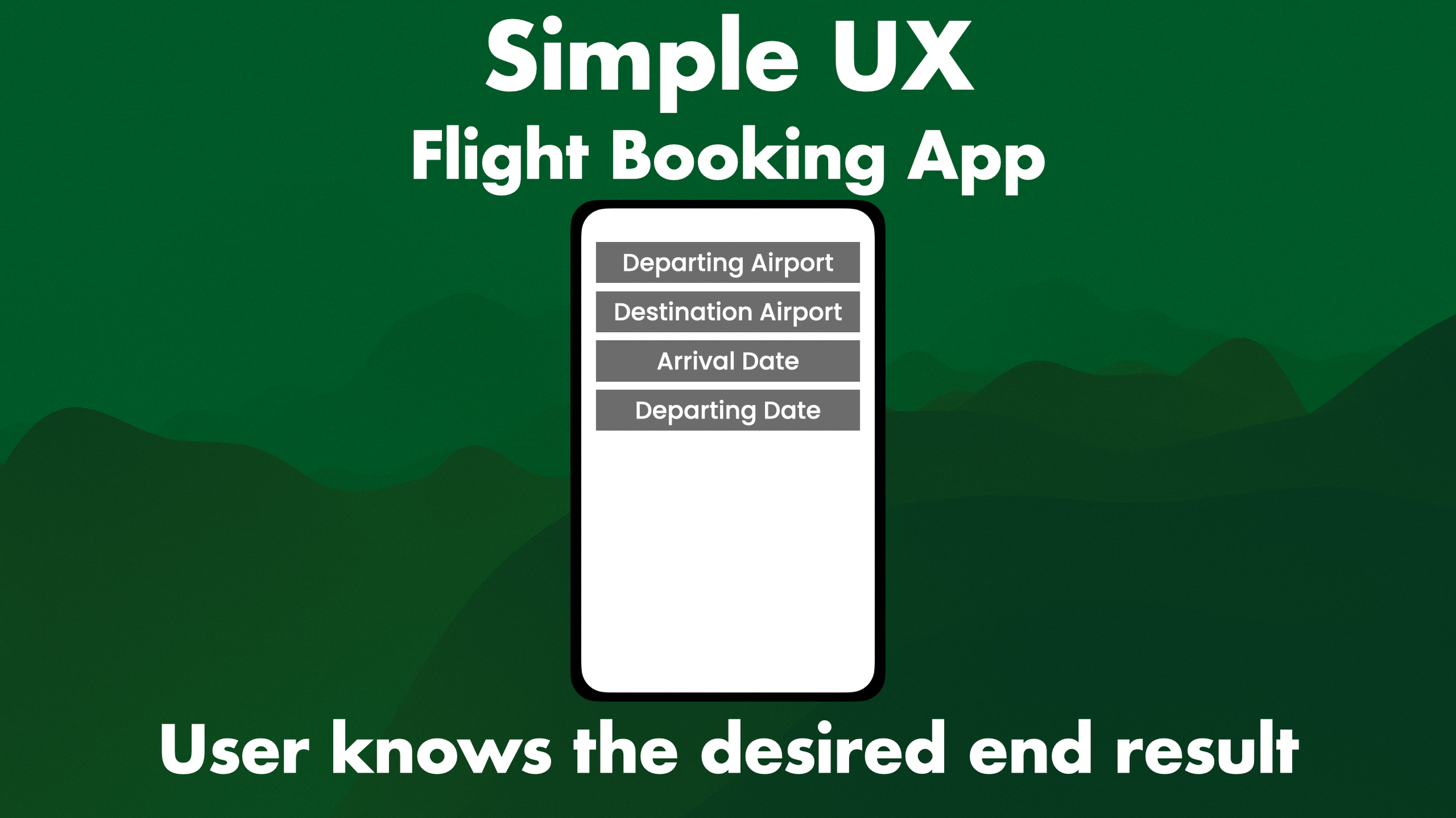
An example of simple UX: A flight booking app. The user knows the desired end result
Now for complex UX. For example, a 3D digital content creation tool, like Unreal. The user could be taking… thousands of actions. In fact, in the middle of doing the work, they may realise they need to adjust what they are doing, and do something else. That is called iteration, and it can be a great thing. The user does not know the desired end result.
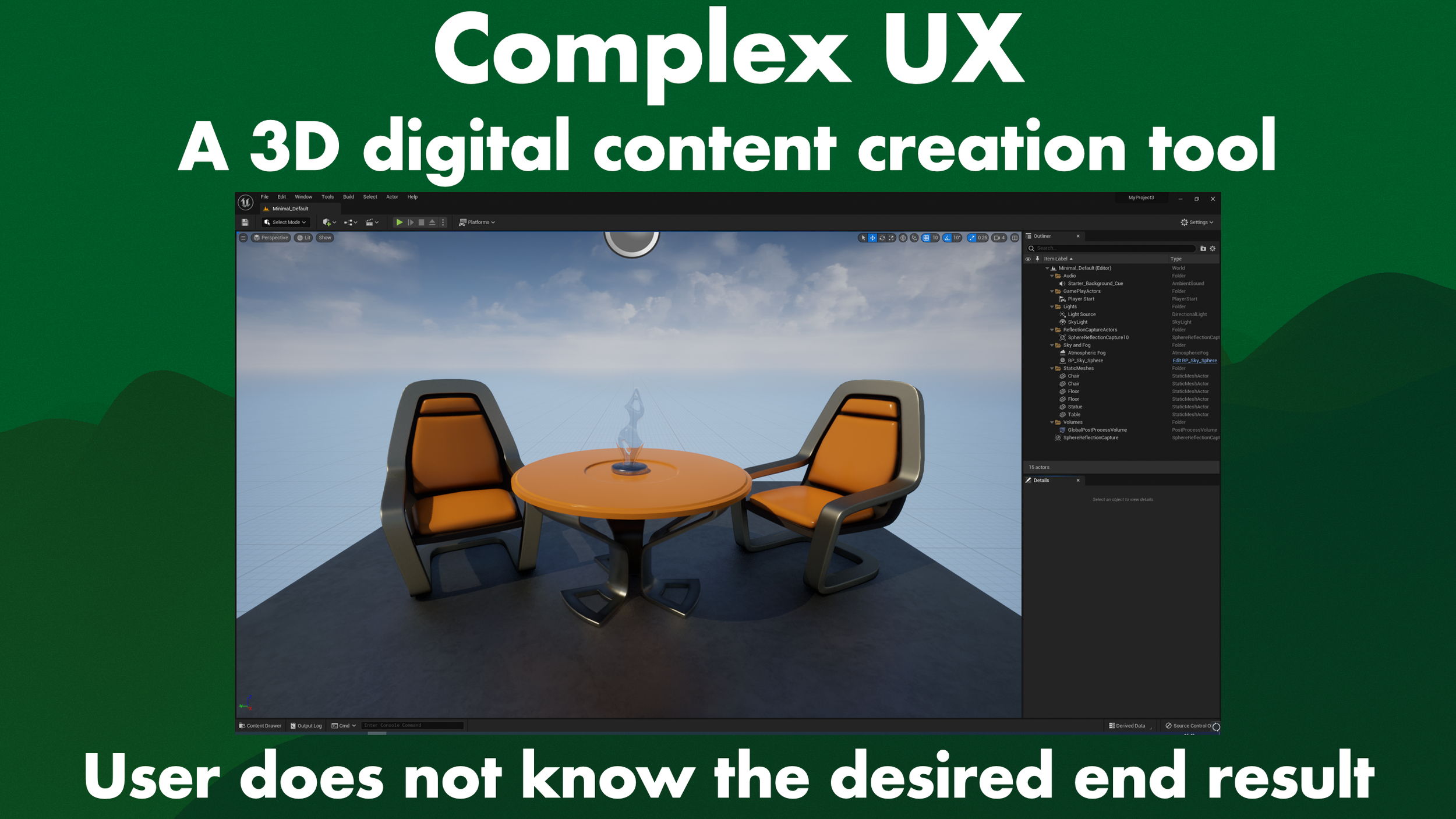
An example of complex UX, the user does not know the desired end result
Simple UX, and complex UX, have differences in how UX is applied. There are more differences, but this is just the basic gist. Also, designing complex UX is not necessarily more difficult than designing simple UX: There are just different target audiences. The flight app tries to have an audience of billions of random people, which is tough to design for, while the DCC tries to have an audience of millions of experts, which is also tough to design for.
And the basics of UX still apply in both cases. For example: Green is good, red is bad. Hover states, mental models, user research, consistency, feedback, patterns, all that good stuff and more. You still have to apply those. But, there are differences too. Basically: I am saying that a 2000’s UX/UI book about website design may not directly apply to AAA video game DCCs. So please stop blindly applying website design heuristics to tools. Thank you.
What really gets me about this is that every designer seems to have read “The Design of Everyday Things” but Don Norman. It’s a great book, I highly recommend it. But barely anyone has read one of his later books: “Living with Complexity”. In this book, released 22 years after “The Design of Everyday Things”, he contradicts and changes quite a few of his original thoughts, which is great! He iterated on his findings. But hardly anyone knows about that because they do not read the book!
I think the kind of Complex UX that I describe here, is what Don Norman calls ‘Service Design’ in this book, but honestly the overlap is a Venn diagram of so many elements that I cannot know for sure. But thankfully there is an other book that does directly go into this! "Interaction Design for Complex problem solving”, by Barbara Mirel. In this books she calls complex UX “wicked problems”, which is a bit 90s to me, but the book was released in 2003, so it makes sense. I highly recommend reading this book as well, especially if you work on the UX of complex software.
Sometimes, it can actually be good to let the user have a lot of options, control, and changes. Just like the pilots in World War 2 had. Now of course that is easier said than done, and you probably have heard, or are thinking yourself, of some counter arguments quite quickly, such as: “What if I have to sit behind someone and their UI looks totally different than what I am used to?”
And that’s such an awful argument. You can have settings to instantly switch between default and custom UIs, like we have seen in various editors and even games so far. Also note that sitting at someone else’s desk is completely dependent on your company, project, and so much more. For some companies this happens very often, in other companies it barely ever happens. I have worked on tools in situations where folks were so afraid of customisation, only because they thought they would have to sit behind someone else to debug something for them, and then I measured when and how that happened, and it… never actually happened. It was just unfounded fear.
But, if it does happen often that you have to sit at someone else’s computer, is it worth it to stay away from customisation and not help the bulk majority of your users for the majority of their time on the projects? Also, why do you have to keep sitting at someone else’s computer? It sounds like there are deeper issues involved that cause you to have to do that, and waste the time of two people on one task, which is a pipeline you should critically look at.
Another usual issue I hear often as a counter argument is: Customisation isn’t free. And that’s true! Allowing for customisation costs time, effort, and thus money. It also means there is more technical debt, as it requires upkeep and maintenance. So how do you decide what to build, and what tools to customise?
Time & Money
It’s actually quite simple. Let’s say we have a lead level designer, making $40 an hour. (This may be very little or a lot, depending on where you are from. I am just grabbing a random number here as an example, the world is a big place!). And we have a Junior Level Designer making $20 an hour. So if they need to be manually placing trees around a level, for 20 working days, that is 160 hours of work
For the lead level designer, that is $6400, for the junior level designer, that is $3200
Then, let’s say we have a Lead Tools Engineer making $40 an hour. (Again, I am just grabbing some easy numbers). And we have a Junior Tools Engineer, making $20 an hour. So if they build a procedural tree placing tool, and it takes them 15 working days, which is 120 hours of work
For the Lead Tools Engineer, that is $4800, for the Junior Tools Engineer, that is $2400
So now, we can calculate!
If the Lead Tools Engineer makes that tool for a Junior Level Designer, it would cost us $1600. Not great. If the Lead Tools Engineer makes it for the Lead Level Designer, it saves us $1600, a little better. But if the Junior Tools Engineer makes it for the Lead Level Designer, we save $4000! That’s way better! Of course, it is never that simple. We have multiple lead designers, and multiple junior designers.
Who all, combined, cost way more money. So if a single Junior Tools Engineer can help 3 leads and 5 juniors, it saves us… $32800! That’s great!
Now that is just a simple napkin calculation, grabbed out of thin air. But hopefully it shows you how a complicated problem of cost vs benefit can sometimes be as simple as A minus B. And you never truly have all the data. Some tasks take more time, some tasks take less time. But what you can do is: You make educated guesses. Which means that sometimes you are wrong, just as with any estimate. But if you have data & a bit of a gut feeling built out of experience, you will solve most problems just fine.
Also, make the commitment simple. When you say “We are going to make the tools nicer to use!” The producer is going to reply “Ok?”. Like, yeah, sure, sounds neat, but what does that really mean? If you say “We are going to save us $32800 in money”, the producer will say “Nice! Wait, how do you know their salaries?”. Which, may be awkward depending on your jurisdiction. But if you say: “We are going to save 2 months of development time for 8 employees”, The producer will say: “SWEET!”, and then they will say: “Let me check if that’s worth it…”
So you can still get a ‘No’ from this, but at least the commitment made it much easier to gauge what you wanted to do. So, customised software isn’t free, that’s true, but it can still save you time, energy, and money, if you do it correctly.
A big reason for this is Tesler’s Law, named after Larry Tesler. It’s also known as waterbed theory. It basically says that all software has inherent complexity. The question is where you put it: In the code, making it tougher to build, but easier for the user? Or do you make it really easy to code, and tougher for the end user? You can decide where to put the complexity, but you cannot remove the complexity. It’s like a waterbed, where the water will move from one area to another, but it can never leave the bed. This… may not work as an example if you do not know about waterbeds. Does anyone even still have a waterbed nowadays?
Anyway, you can decide where to put complexity. Customisable software takes more time to build, but also makes your users faster and happier, but it does require more time on the engineering side for them to deal with the complexity of allowing for customisation. That is a trade off, for which you can calculate, and gut check, the cost and benefit.
And of course, as mentioned before, customisation is great for accessibility. Now you might think that accessibility isn’t necessary in your software. Nobody ever asks for it, right? Don’t make me talk about planes again!
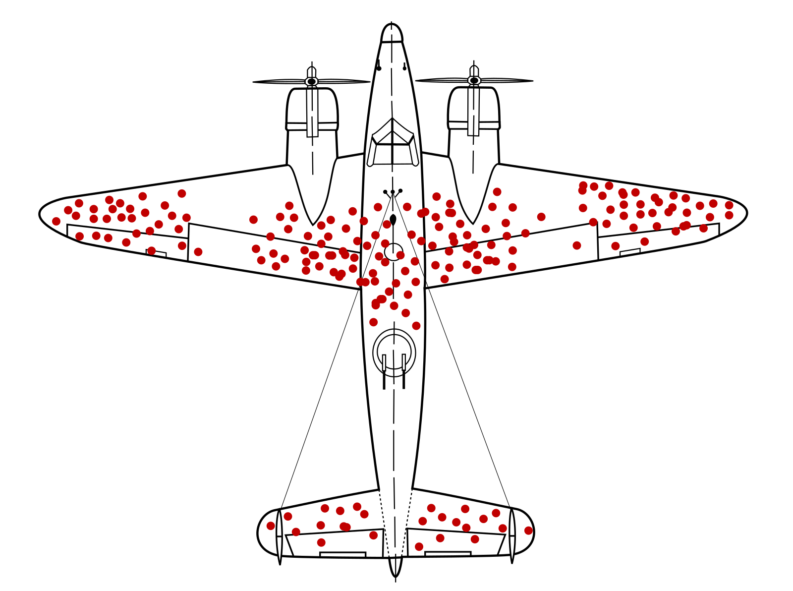
Survivorship bias airplane from https://commons.wikimedia.org/wiki/File:Survivorship-bias.svg by Martin Grandjean (vector), McGeddon (picture), US Air Force (hit plot concept)

Specifically this one. Survivorship bias. You have nobody asking for accessibility, because they cannot even be in the room with you to ask for it, and if they do get into the room and are then not listened to, they leave, and those very smart people will be gone. You do not even know what you are missing. I love the pepperoni airplane, as I like to call it, and I wish a UX conference served pizzas in the shape of them.
So, as we have now seen, if someone says: “You are failing to make a decision, and pushing the decision on the user.”. they are incorrect. Literally, actually, because that is not the original quote.
The original quote is:
“Every time you provide an option, you’re asking the user to make a decision. That means they will have to think about something and decide about it. It’s not necessarily a bad thing, but, in general, you should always try to minimize the number of decisions that people have to make.” - Said by Joel Spolsky, in a blog post.
And while I am going through quotes, here is another one for you:
“To follow a default is to allow someone else to make a decision for you. This does indeed simplify decision making, but it is desirable only if you agree with the choice.” - Said by Don Norman, in Living with Complexity, page 243.
Remember when I said nobody reads Living with Complexity?
So yes, you need default settings. But do not think of them as ‘sensible’. Instead, think of them as ‘editable’. Customisation is super helpful, and you should not shy away from it. Now there are way more things I can get into when it comes to UX, accessibility, and other issues of suboptimal workflows for your team. They have more mental overhead, and less creativity. It take them longer to start working and being effective in your projects. There are more unhappy people, and churn.
But, this video is long enough already. Those are topics for another time, please like & subscribe if you want to hear about them, and hit up my Patreon if you would like to support me. Feel free to follow me on Bluesky, and LinkedIn. If you prefer blog posts only, you can subscribe to those below.
So, in short, what did we learn here today? Every editor is different. Every user is different. Every workflow is different. The difference between simple UX & Complex UX. And do not design ‘sensible’ defaults, instead design ‘editable’ defaults.
Thank you, and a special thanks to all the folks who provided feedback and thoughts on this presentation. I super appreciate all of you.
Post-addition
(A comment I get a lot on this video, is "If we build 'defaults' instead of 'sensible defaults', then defaults will be bad!" And to me that is like someone telling you to make 'a design' will make you make a bad one, but if they tell you to make a 'good design' then it will be better.
What nonsense is that? Obviously the default has to be usable, but thinking of it as 'sensible' is the grave error that causes a disconnect to discount customization. My problem isn't with the word 'sensible'. If folks were to call it a 'proper default', a 'best default', or a 'wise default', they all still carry the same sentiment, and it is that sentiment which discourages thinking about customization, and that causes us to lack it in the software we use, and build. That is also why I make the comparison to 'Best Practices'.
If someone were to call Agile a best practice, and use it on your project, but you hate it, would you still consider it best, because someone else thinks so? And similarly, it will cause that person to use Agile everywhere, despite it not fitting everywhere, as they think it's 'best'. No, there are practices, and some of those will work for you, and some won't, and it's on you to figure out which is which, but that does require a mindset in which you even start to figure that out.)